









The leaderboard can now show you the past - what the field looked like on any date, how a single model moved through it month by month, and why two models traded places.
A Leaderboard that Remembers
Imagine turning on a Formula 1 race and only getting to see the final frame: all the cars frozen at the finish line, the winner already declared, and the whole race reduced to a single result. You would honestly feel like you missed the race.
That is often how leaderboards can feel. We see rows of names, scores, and rankings - a neat snapshot of who is winning right now. But we miss the turns, the overtakes, the crashes, the moments when everything changed.
What if the story behind the rankings mattered just as much as the final result?
That question drove this update: not just a leaderboard that shows the present, but one that remembers the past.
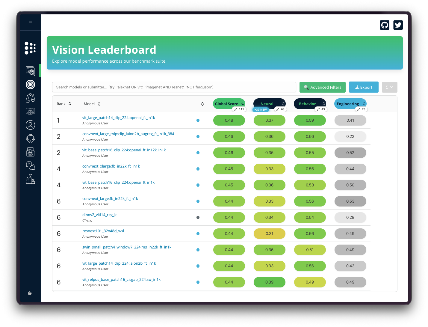
A leaderboard, at least on the surface, feels like a present-tense object. It tells you who is winning now, which models score highest now, which benchmarks matter now.
But science does not happen only in the present tense. Papers are written at specific moments. Models are compared against the benchmarks that existed then. A score that looks ordinary today might have been impressive two years ago. A model that seems buried now may have once been near the top.
So the real question became: how can we make Brain-Score remember itself?
Looking backward: the Wayback view
The first piece is a Wayback Machine for the leaderboard: pick a date range and see what the field looked like then - which models ranked where, and which benchmarks actually existed at that moment.
That sounds simple enough. It is not. A slider can move smoothly and the page can look polished, but if the wrong scores survive the filter, the tool is not remembering history - it is inventing it. Getting this right meant establishing which scores were valid at which times, how benchmarks entered the tree over time, and how parent scores aggregate from their children.
This is also where the feature becomes scientific rather than cosmetic. It is not about hiding and showing rows. It is about reconstructing a model's place in the field at a given moment. A leaderboard that only knows the present can tell you who is winning. A leaderboard that understands time can begin to explain how the race changed.
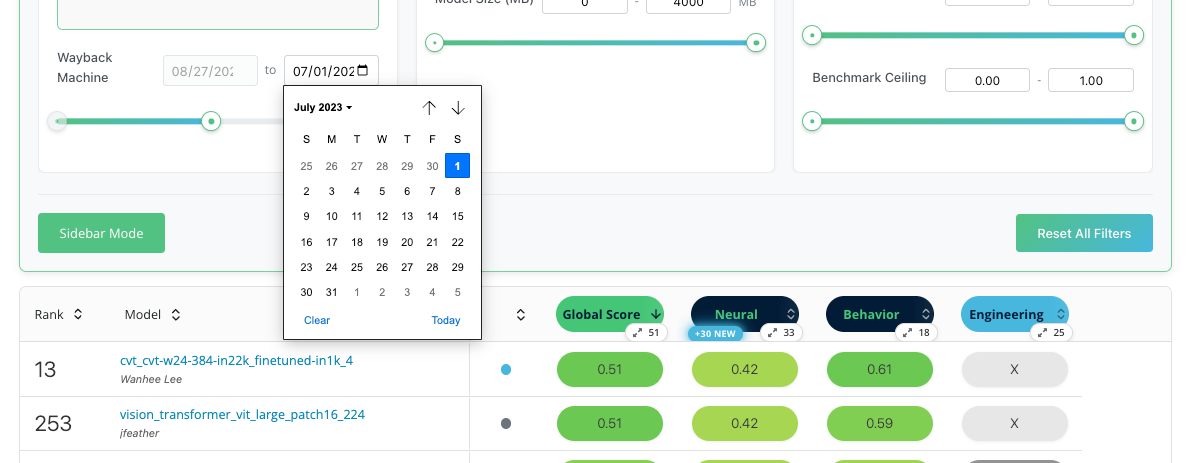
As a case study, vision_transformer_vit_large_patch16_224 tells a story the old leaderboard alone could not. In August 2023, it sat tied for first on the vision leaderboard - a model that looked like a serious contender in the field. Open the same table today and it has slipped below 250th place. That drop can read like failure, as if the model simply got worse. The Wayback view pushes back on that reading. It does not erase the past; it restores it. You can see the model where it actually stood - among the benchmarks and competitors that existed when it was strong - and ask a better question: did the model fall, or did the race change around it?
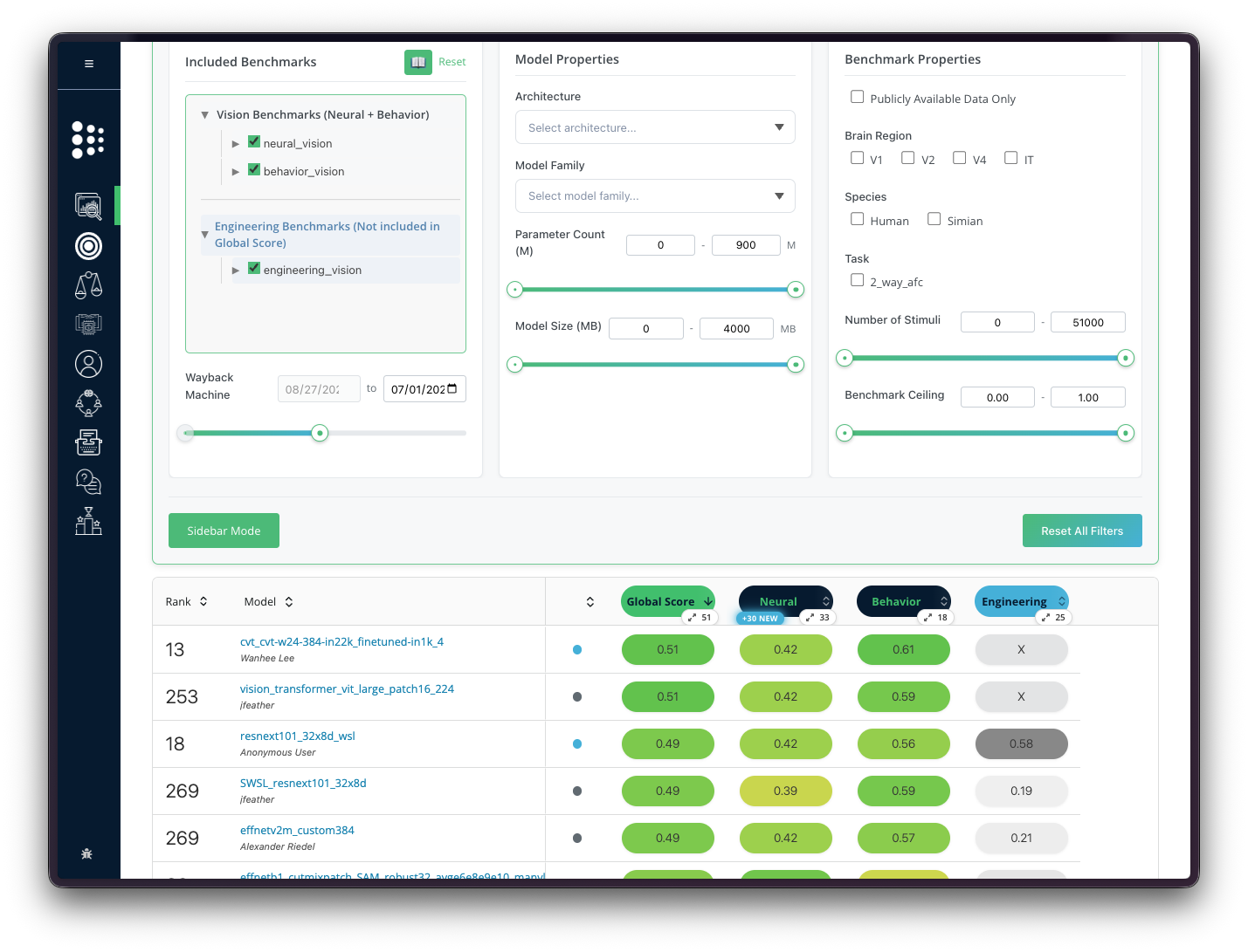
The Wayback view shows where every car stood at a given lap - but a single snapshot still cannot tell you how one driver got there, or when the race turned. To answer that, you have to follow one model across time.
Following one car: model history
Showing a model's history required teaching Brain-Score to remember its own scoring process month by month.
That meant rebuilding the benchmark tree over time, determining which benchmarks counted in each month, handling missing scores, and rolling everything back up into the single number people see on the leaderboard. In effect, the system does its usual math backwards through time. It has to know not just what the score was, but what version of the field that score belonged to.
With that in place, the history becomes visible. On each model page, a "Historical Trend" chart now shows how a model's average score and rank moved month by month. That alone lets the leaderboard show change rather than just the present. But it raises a better question immediately: if Brain-Score can show that something changed, can it also explain why?
That is what reason attribution does. Instead of stopping at a falling line or a rank drop, the system says what changed around the model at that moment. Did the model improve? Did a new benchmark enter the aggregate? Did the competitive field shift? Did the scoring landscape simply grow more demanding?
The result is a clean division of labor. The chart shows what changed. The sidebar explains why that change mattered.
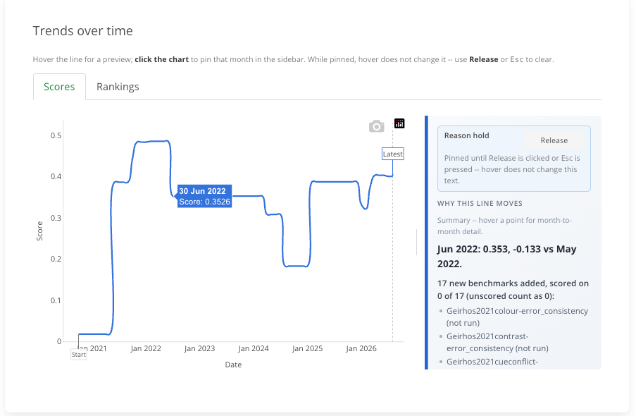
In the figure above, the line falls sharply in June 2022. The sidebar explains why: the Geirhos benchmarks entered the aggregate, and this model cannot run on them at all. An unscored benchmark counts as zero, so the model's average drops even though nothing about the model itself changed. The distinction matters for research. A drop in score or rank is not always "the model got worse." Sometimes the track changed: new benchmarks were added, the competitive field grew, or scoring was updated.
The duel: comparing two models
A single model's history can tell you a lot, but the race becomes most interesting when two cars are close enough that every turn matters.
That is where the compare page comes in. Instead of following one model in isolation, it lets you watch two models move through the same benchmark landscape at the same time. In the example below, cvt_cvt-w24-384-in22k_finetuned-in1k_4 and resnext101_32x48d_wsl spend long stretches running close together. Neither one stays permanently ahead. Their scores tighten, drift apart, and come back together again, which makes the comparison feel much more like a race than a static leaderboard.
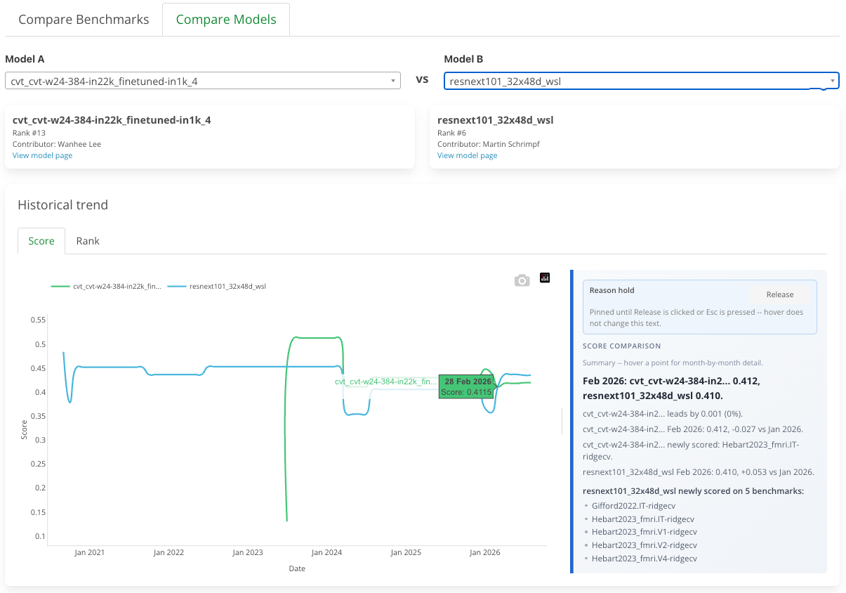
The chart shows the two trajectories side by side, but the real power is in the explanation beside it. Hovering over a point does not just show who is ahead that month. It also explains what changed for both models: whether new benchmarks entered the aggregate, whether each model was actually scored on those new benchmarks and how they ranked against each other on them, and whether the gap changed because one model improved or because the track itself changed around them.
The compare page completes the picture. The Wayback view shows the old grid. The model page follows one car across the season. The compare page shows the duel itself. It turns the leaderboard from a frozen finishing order into something closer to a replay, where you can finally watch the overtakes happen and ask why they happened when they did.
Not every rank change is a story about a worse model. Sometimes it is a story about a growing, shifting scientific benchmark. All three views are live now: the Wayback slider on the leaderboard, "Historical Trend" on every model page, and the two-model timeline on the compare page.
Keep exploring on Compare
The timeline is now one part of a much richer Compare workspace. Compare benchmarks with the neural-versus-behavior scatter plot, browse a selectable benchmark correlation matrix, and see whether relationships remain stable over time. Switch to Compare Models for top benchmark differences, the model difference tree, score distributions, and branch ranks. The benchmark analyses share Wayback and model-completedness controls, while the visualizations offer expanded views and downloadable data, so you can move from a leaderboard result to deeper analysis without leaving Brain-Score.